Client
Rado
Project
Upgraded Experience Through UI/UX and Content Strategy
Industry
B2C
Fashion
Services
Content and Creative
Customer Experience (Cx)
Innovation


BACKGROUND
Rado is a world leader in the design and manufacturing of luxury timepieces. Known for their use of cutting-edge technology, innovation and use of fine materials, they were the first watchmaker to create the ‘scratch proof’ watch and one of the first to develop a deep-sea diving watch. Rado has roughly 470 employees and produces about half a million watches a year that are sold in more than 150 countries across 5900 different points of sale.BRIEF
Rado is a globally recognized brand, famous for its innovative designs and use of revolutionary materials to create some of the world’s most beautiful and durable watches. BORN was tasked to redevelop the Rado website, focusing on improving the UI/UX design and content strategy for an enhanced mobile user experience.GOALS
This project aimed to develop the website’s eCommerce functionality and content management, increase brand awareness with updated content and SEO, and migrate the site with customized Drupal functionalities to the Magento2 platform.


CHALLENGE
The website required engineered wire-frames, modules and templates for improved UI/UX functionality, developed site features (contact and special order forms and ‘click & reserve’ page), multiple translated site versions and reimagined brand content.OUR APPROACH
Improved Mobile-Friendly Design
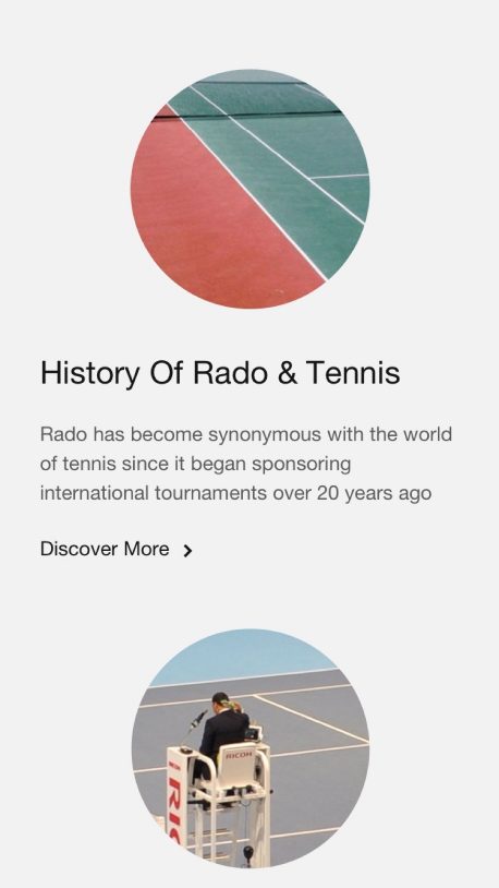
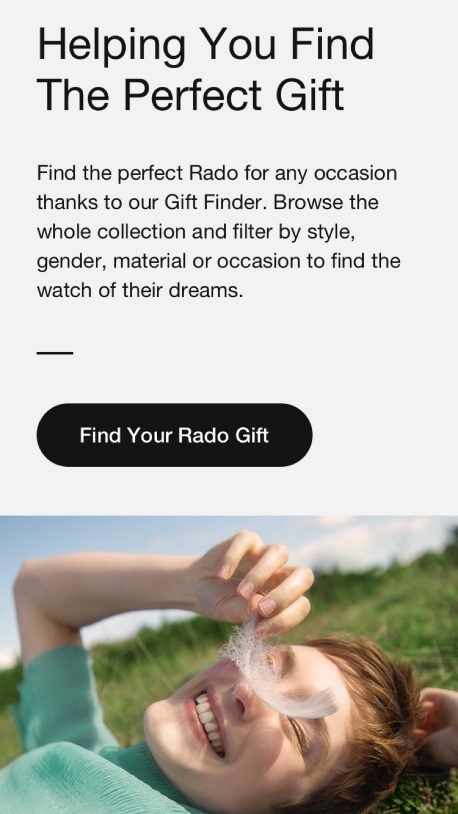
BORN enhanced Rado’s website by overhauling UI/UX and brand content. The team recreated product pages to better showcase and describe the complete product line, including an improved gift page for an upgraded purchasing experience. As a final step, the website was successfully migrated to Magento2.


UPDATED BRAND CONTENT
BORN reimagined how Rado’s products were displayed throughout the website to highlight their first-class style and design while optimizing the brand story through SEO and content strategy.

MOBILE-FRIENDLY INTERFACE
BORN redesigned the mobile interface to improve the user experience by optimizing the website’s content and navigation to be more appealing for viewing on personal devices to help drive mobile conversions.


OUTCOME
BORN created a redesigned website for Rado that tells the brand story using conversational, inspirational and engaging content, leading to improved customer engagement. The website offers customers a better purchasing experience, including an updated gift page featuring visual sizing. These upgrades allow further upselling, including improved personalization, engraving and specialized ordering.


