

Client
Tetley
Client
Tetley
Project
Tetley Tea Photography
Industry
Food & Beverage
Services
Art Direction
Content and Creative
Photography
Strategy
Tech
UX/UI


Background
With a history spanning over 180 years, Tetley has become a household name for tea lovers worldwide, selling over 60 tea bag varieties across 40 countries. When Tetley wanted to build a new website to showcase its global brand, BORN was engaged for its design and technology expertise.Business Objective
Tetley chose BORN as its design and technology partner and Acquia (Cloud Site Factory) to build a unified website platform for its global tea brand. The objective was to create new content for 4 regions (US, India, Canada, and the UK) for its new categories’ sections for PDP pages.The Challenge
BORN’s biggest challenge was to create visuals that would work for all locations, while still considering local preferences and cultural differences. The team had to work remotely, collaborating with each team to ensure they knew each region’s exact requirements for imagery.Artfully Planned Photoshoot
BORN’s team meticulously planned the shoot with our art director, photographer, and stylist, creating detailed scamps and props lists for each shot.


Creation of a suit of asset for a full e-commerce and tactical activation
Lifestyle and category images, to use across HP, PLP, PDP, with some variations for each different region.


Contents delivering a localised visual strategy while offering an overall global consistency
The team mapped out the style of light and colours to use to create a consistent look and feel but using different types of props to translate the various kinds of different “tea rituals” specific to each region.

Seamless multi-country workflows
Thanks to BORN’s in-house Cito software, Client teams, in multiple geographies, could mark up specific change requests and amends, where required, ensuring a unified approach across all regions.


Client
YSL
Client
YSL
Project
Yves Saint Laurent Photography
Industry
B2C
Beauty
Luxury
Services
Art Direction
Content and Creative
Photography


Background
Yves Saint Laurent Beauté is the cosmetic line of the eponymous Parisian couture brand. Established in 1964, it offers a range of products across make-up, perfume, skincare, nail care, and men’s grooming products. In the wake of Saint Laurent, who showcased the spirit of the times for nearly 40 years, YSL Beauté continues its unbridled love affair with women to create, shape and develop modernity.The Challenge
Requirement for high volumes of product photography, with a combination of models and still life – within one day.Solution Highlights
Running multiple sets at the same time with additional resource to maximise model usage and content output.
Mobile optimised assets for social media
All the visuals created for this campaign were both destined to point of sale and social, which BORN needed to take into consideration when creating its compositions.
Complemented product & setting
The team shot products on different backgrounds, playing with a palette of clear colours and textures as well as reflective perspex blocks, which would nicely complement the product and offered more variations to the online catalogue.

BORN added some soft-gel colour effects in post-production to add more depth and volumes to the visual, for a more elevated look.

Client
Sainsbury’s
Client
Sainsbury’s
Project
Photography
Industry
Beauty
Cosmetics
Services
Art Direction
Ideation
Photography
Styling
Background
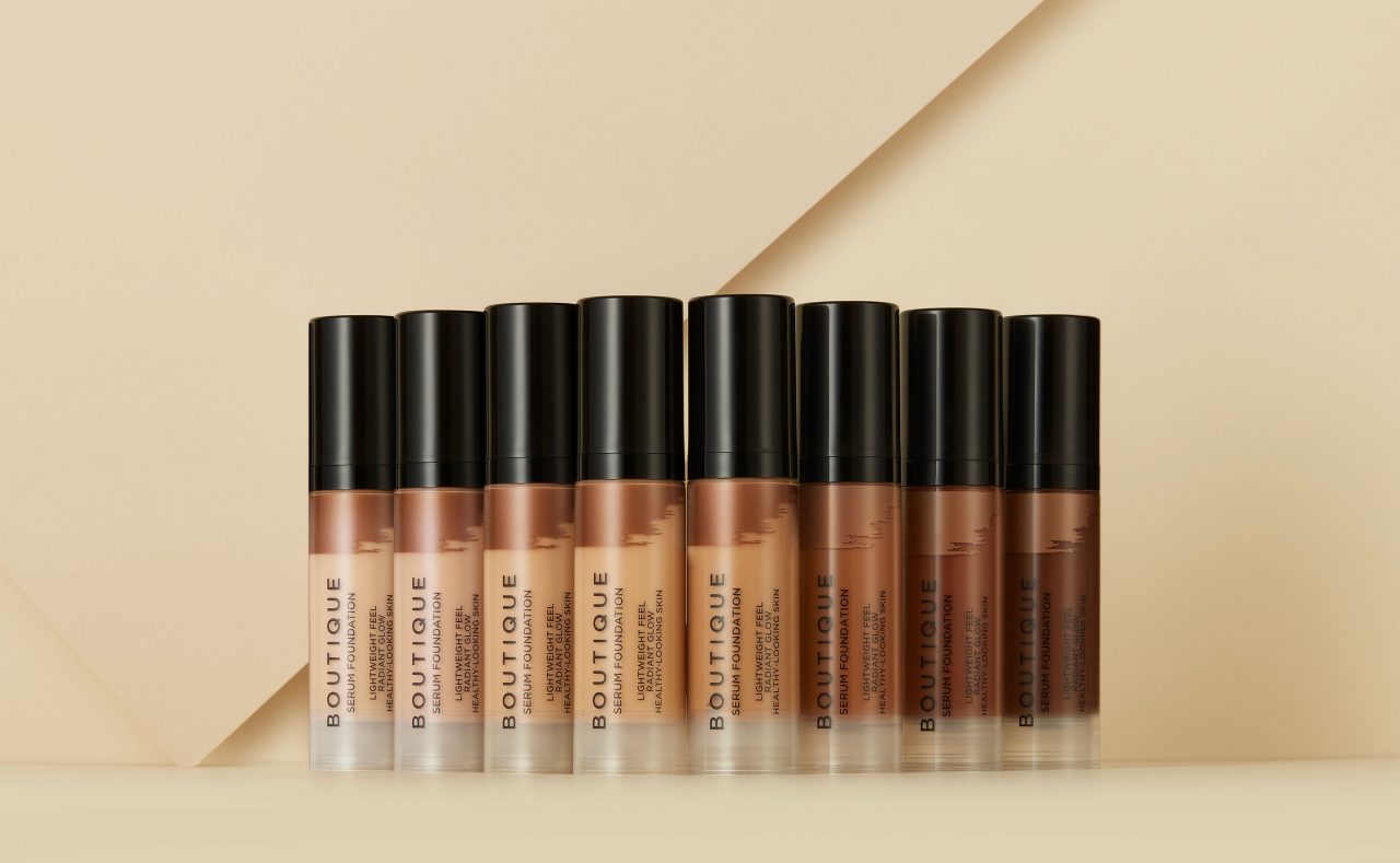
Boutique is a leading cosmetic brand offering high quality and affordable products. Developed in collaboration with renowned makeup artists Jo Saville and Sophia Price, Boutique offers a diverse range of beauty products including lip gloss, nail polishes, lipsticks, eyeshadows, and accessories. The products have been thoughtfully crafted with long-lasting formulations, rich pigmentation, and effortless application.Business Objective
Boutique was looking to elevate its product photography and showcase its overall offerings in a more contemporary and compelling way. The company approached BORN to create images for both their core products (e.g. foundation, mascara, lipstick) and on-trend products to improve a consistent branding and digital experience.The Challenge
BORN had to meet Boutique’s product photography criteria within a tight budget and a quick turnaround. BORN worked alongside a stylist to simplify the production process and maximise the output while maintaining high quality and a consistent look and feel.


Captivating colours and visuals to drive conversion and engagement
BORN identified the ideal colour palette and visual style that would give Boutique’s products the right appeal and glamour it aimed for. The complementary and pastel colours conveyed a smooth yet fresh style to each product.Crafting compelling concepts
Our team crafted a range of creative concepts to address the client’s specific needs. Through brainstorming sessions, we developed compelling routes that aligned perfectly with their objectives.
Seamless Digital Transformation
The team was able to capture the essence of the entire product range in one day and transform the physical experience into an engaging digital presentation. The new look caters to customers interested in high-quality, affordable cosmetics.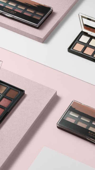
Client
Sainsbury’s
Client
Sainsbury’s
Project
Photography
Industry
Accessories
B2C
Luxury
Services
Art Direction
Creative Direction
Photography
Production
Retouching
Background
Penhaligon’s is a British perfume house founded in the 1860s by William Henry Penhaligon, appointed Court Barber and Perfumer to Queen Victoria. Today, Penhaligon’s (part of PUIG) is still crafting exquisite perfumes that capture the essence of British elegance and refinement.Business Objective
Over the years, Penhaligon’s collaborated with several agencies and photographers. As a consequence, all its visuals, produced at different moments in time, were following very varied styles. The website and online catalogue lacked consistency and appeared as a patchwork of very contrasting images.The Challenge
No consistency between the existing photography, with varied content that had been shot without any continuity and many variations in terms of shadow, angle, light etc… The initial project required to reshoot over 1,000 shots on a tight production schedule of 15 days. The new assets needed to reflect the new brand identity and work harmoniously with the new Campaign in terms of style, colour palettes, visual guidelines etc.


Creative Objective
Penhaligon’s was aiming to elevate its digital presence, to match the quality of its creations and showcase modern elegance. Penhaligon’s reached out to BORN to redefine the visual signature of its online catalogue, by introducing new rules and guidelines that would consolidate the aesthetic of the brand, while insuring more visual consistency.


